- Follow us
-

-

-

-

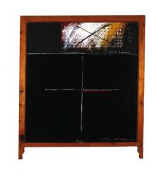
Ralph Hotere
Towards Aramoana, 1982
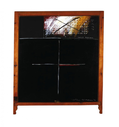
Walk on wet sand; in the extreme shallows where water and sand seem one substance until disturbed and forced apart, momentarily, by the weight of your foot. See how quickly the liquefied sand oozes back creating a delicate membrane that erases your footprints. Notice how the glossy sheen bounces your eye off its surface with bright flashes and then just as suddenly lets you glimpse depth. Hotere’s slick car-body blacks do the same: they bounce your eyes off, all surface and glare; and then they let you see a whole breath-swallowing night sky, or a dark room, just beyond the glass, lit by a wood stove and warm murmurings.
In 1981 there was a proposal to build an aluminium smelter on top of the Aramoana salt marsh, near the mouth of the long harbour that flows towards Port Chalmers and Dunedin. Looking northeast from his former Port Chalmers studio, Hotere’s view took in the fragile Aramoana sand spit and salt marsh, pathway to the sea. His was a constant view Towards Aramoana. His eyes knew it; his feet knew its grain and pulse; has hands and belly knew its shellfish; his lips knew its saltiness. In the painting it as if Hotere is drawing a line in the sand which says ‘Enough!’ It is a line in blood under the right hand axis of the cross, just like the Aramoana sand spit juts out into the harbour.
The smelter consortium erected a large sign on the salt marsh to mark its intentions. Cilla McQueen later described how one evening she and Hotere drove to the place with a bucket of black paint which Hotere sloshed all over the sign. The memory of this sign and the artist’s gesture are emphatically declared in the top right corner of Towards Aramoana. The central cross repeats the action, making a double cancellation of the salt marshes by the smelter; and of the smelter by those who rallied to oppose it.The black window is a memorial to imminent loss and a prophetic warning.
Though the Aramoana series reference a particular landscape, they are not really landscapes. They are brooding, angry and reflective gestures. With all their scratching and crosses and text they are eloquent visual poems to thought. They are about thought, and they are thought in action; and all the more powerful because of their colour. What is the right colour for incredulity, anger, determination, indignation? And within these, what is the colour for hope that must persist? Surely, it is black.
Previously published in The Bev & Murray Gow Collection, 15 September 2007, Art+Object the 21st Century Auction House, Auckland, pp119-120.