- Follow us
-

-

-

-

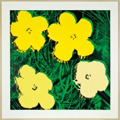
Andy Warhol
Flowers 72, 1970


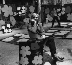
There’s a black and white photograph of Andy Warhol at The Factory from 1970 where he is surrounded by various versions of “Flowers 72”. Like a pop star, framed within the square format of the photo, sitting in the strong chiaroscuro of daylight falling from overhead skylights, he stares out at us from behind his dark glasses, with his elbow supported by the chair and his chin resting in his hand. His is the pose of the poetic genius, while behind him, to either side, studio assistants stand in mock heroic poses holding other versions of “Flowers” aloft.
It is an image which captures the spirit of Warhol’s balancing act between invention and imitation; namely the invention of a new art idiom specifically through the imitation of promotional languages and factory methods.
It is a photograph that looks playful, as if put together in the moment, spontaneous and fresh; yet at the same time it has all the mannerism of advertising, and especially, as intimated above, of the earnest formalism of late 60s and early 70s album cover photography, reminiscent of albums by The Doors and even Andy Williams. The photo also imitates the genre of the portrait of the artist discovered, or revealed, in their loft studio: contemplative, surrounded by the clutter of their work and its inspirational sources, sometimes attended by assistants in the background, the whole suffused by a soft yet dramatic light falling from above. It is the genre of the romantic genius. Knowingly Warhol imitates this vernacular, and the way it had been adopted by the new poets of the age, pop and rock musicians, at the very moment his practice eschewed the idea of the artist as originating genius in favour of the artist as brand.
“Flowers 72” (listed in the Feldman and Schellmann Catalogue Raisonne, reference F&S II. 72) and its many cousins from 1970, originated as a found image of Hibiscus flowers torn from a magazine. Warhol presents the image as just a flower. The botanical specificity of the blooms is almost entirely obscured by Warhol’s grainy photo-screen rendering, flattened hues and deliberately mismatched colour separations. Equally, the image is not burdened by any allegorical or moral weight in the manner of the memento mori flower and still life paintings in the long European tradition preceding it. The colour palette of the print is strangely reminiscent of the greens, yellows and blacks of National Geographic magazine covers, yet we learning nothing from the image. It is flat and decorative. “Flowers 72” is all surface, or surfaces, given the quirky layering of reprographic dot screen and colour separations; and as such, marks a high point in Warhol’s life work of flattening culture into sign.
Previously published in Important Paintings and Contemporary Art22 November 2011, Art+Object the 21st Century Auction House, Auckland, pp34-35.