- Follow us
-

-

-

-

Lost in a dream
Curator's exhibition essay

I think I’ve been here before, but I’m not certain: happily adrift among cuddled cats; flash-backs after a car crash; Mozart playing on a train; a date in the teacups; and hallucinations before sleep. “Lost in a dream” gathers work by fourteen artists who have a knack of positioning the viewer in a space between two seemingly separate or contradictory places. Variously each work submerges the watchful viewer in a sort of fog; making them feel as if they may be lost between waking and sleeping, health and malady, certainty and confusion, maturity and childishness, rationality and obsession, truth and dream, true love and foolish cliché, or sobriety and drunkenness. Sobriety and drunkenness: not one or the other, but both at the same time; both struggling for supremacy, but neither achieving it.
Given the uncertainty of perception that these works might create, it is hoped that they will stimulate imagination in unexpected ways. Each work has a palpable sensuality; a direct seduction with the power to hold, even enthral. This immediacy is both sustained and undercut by an awakening; creating awareness that all is not revealed or present in this moment of confronting the art work. Perhaps this will stimulate curiosity.
Our premise is that a state of uncertainty can be a productive field; that it can be a space of speculation, wondering, doubt, anticipation; and therefore of imagining what is not yet known. Uncertainty may be a state which can lead to creativity; to the generation of new thoughts; or to the emergence of unexpected or unfamiliar sensations; and perhaps the experience and expression of untrained emotions. The works in “Lost in a dream” have been chosen in the main to invite us to wonder; and to wonder as much at our own inability to make up our mind about what is going on.
The artists: Olga Chernysheva (RU), Georganne Deen (US), Cécile B. Evans (BE/US), Robbie Fraser (NZ), Grant Gallagher (NZ), Emma Garrett (NZ), Nathan Gray (AU), Paul Hartigan (NZ), Alexander Ilin (RU/NZ), Katrin Kampmann (DE), Anastasia Klose (AU), Virginie Mossé (FR/DE), Anna Nordquist Andersson (SE) and André Sampson (NZ).
L
In Olga Chernysheva’s “The Train” we witness a mysterious slippage between the interior of a Moscow train and what looks like a bleak hospital corridor; and then we slip back again, without narrative explanation or apparent logic. Chernysheva’s point-of-view filming and the looping movement from one mise-en-scène to the other and back produces a moment of befuddlement, like encountering a fold in space-time.
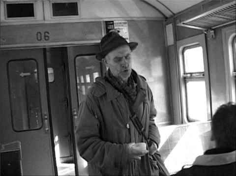

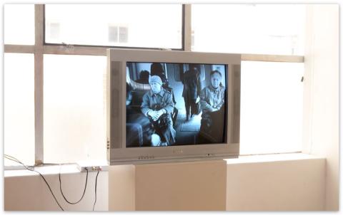
Chernysheva’s interest in the atomisation of post-Soviet society, a social counterpoint to the inheritance of collectivism, is most powerfully conveyed by the eye of the camera in this video. In later video works the artist observes individuals in public engaged in what seem like private moments of activity at the same time as being in a public setting or action of the masses: a lone figure is seen from a distance going through an exercise routine on their own in a park; a woman steps aside from a political march through the streets, to rummage through her bag for something, before returning to the processing rally.
In all these works we find people in situations somewhere between privacy and public action; and the more public the context or action, the more inwardly focused the person seems to be. In “The Train” this dichotomy between the public body and the inward consciousness, suggested by the poetic jump from one corridor to another, plays out more within the roving eye than in those observed by the camera.
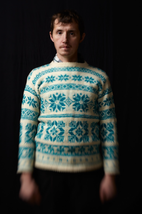
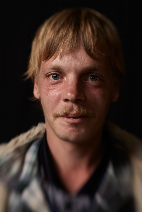
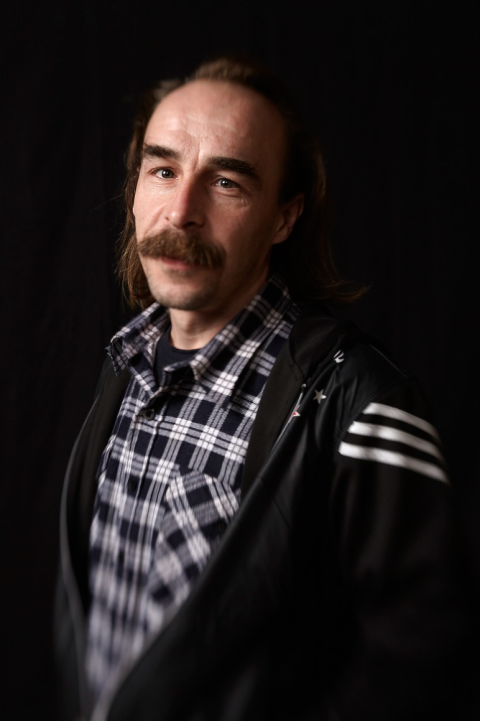
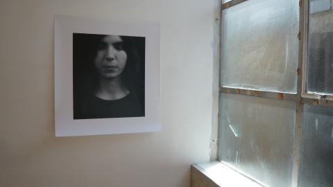
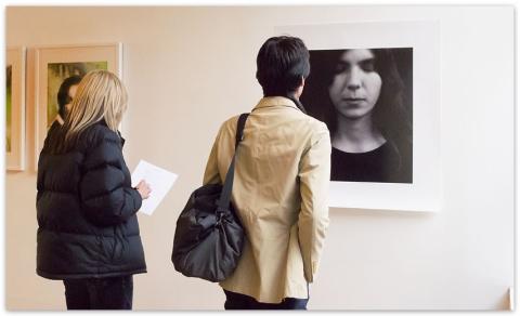
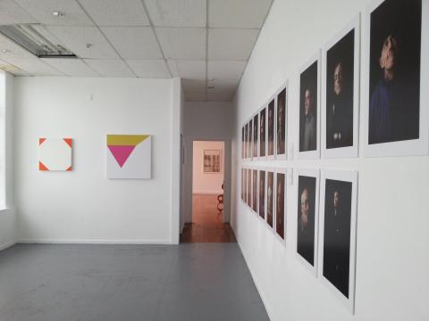
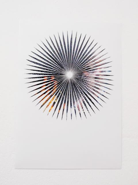
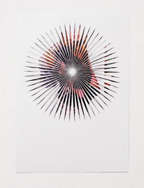
The nineteen portraits in Alexander Ilin’s Project “19” are powerful and mesmerising. Even without knowing their origin and the artist’s conceptual impulse, they do what good portraits ought to: create a compelling humanity and authentic immediacy. But they provide another experience because they are, in a way, out of context in Auckland. The nineteen portraits were shot in Russia and arrived in Auckland along with the photographer when he immigrated here at the beginning of 2012. These works speak as much to the conditions of cultural, geographic and temporal displacement as they do to presumptions or prejudices about what healthy and unwell people look like; and it is because of these questions which infuse the project that we have chosen to show the entire body of work rather than make selections. Viewed in Auckland far from the context in which they were made, and the social context they were intended to address, Ilin’s portraits are intended to interrogate the question of what differences in meaning lie in the shift from one place to another. In very simple terms, we are encouraged to approach these works with the question: what different meanings are conjured when looking at these portraits in Auckland compared with in Moscow?
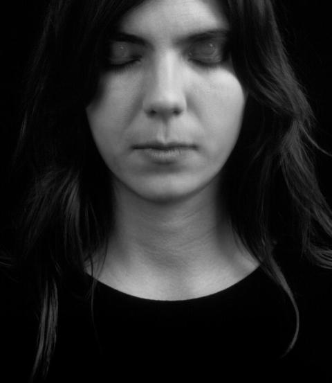
The title of Anna Nordquist Andersson’s “The Hypnagogic” points to the vivid visual hallucinations that can occur at the transition from wakefulness to sleep; as do the semi-transparent eyelids of the woman in the photograph. This transitional hypnagogic state produces a field of visual and cognitive uncertainty akin to the moment when Alice notices the white rabbit run past her, take out a watch from his waistcoat pocket, and disappear down a rabbit hole. Almost immediately Alice finds herself tumbling down the burrow after him without a thought for the consequences. Here and there at the same time: asleep in the field and down the hole. So too the doubled gaze of “The Hypnogogic” infers with wakeful yet closed eyes, the state of being in oneself; and with sleeping yet open eyes, the state of looking through, and of being somehow propelled forward by a vision, being drawn into an immaterial but vivid world. This is the leitmotif of “Lost in a dream.”
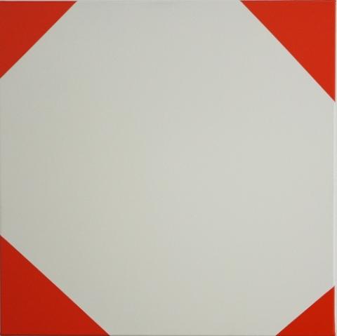
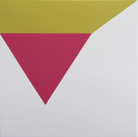
Robbie Fraser is preoccupied with a different immateriality. His colour fields and geometry occupy conceptual space beyond the tangible bounds of the works, though occasionally they touch a canvas form, and thereby the parts of their larger wholes that touch, suddenly become visible. This is how we must approach Fraser’s work if we are to appreciate the shape of space around the works that his coloured shapes want us to imagine; and perhaps in our mind’s eye, to see, at the same time as we see his painted surfaces. It is as if broad, but paint-thin white, grey, orange and green planes have touched down, only in part, on his three canvasses. In what directions and orientations do the invisible areas of each of these planes extend beyond the canvas: out to the sides, through and behind, or inclined towards us into the room? While our eyes rest on the surfaces of the canvases, it as if Fraser wants our mind to map invisible geometries in space; to see the unseen.
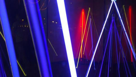
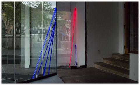
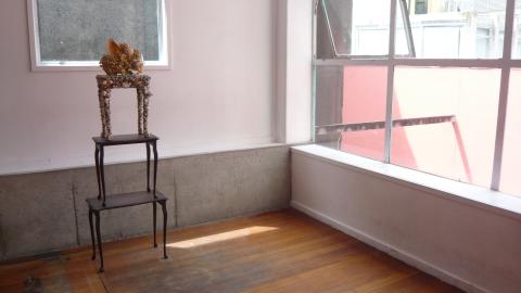
The immaterial, but deeply affecting qualities of light, and light effects, have long compelled artists to find new ways with materials and representation. Paul Hartigan’s quest is to present immateriality. “Strip House – (Indigo Lane)” creates a volume of light and colour which at different times of the day and night, and at different moments in its ramping pulses, spills out more or less to occupy the surrounding space with degrees of intensity and subtlety. The work invites you to stand in its glow; in its ebb and flow. This is where the uncertainty principle is most sublime because it is where the immaterial also seems palpable. Here Hartigan’s choice of colour ramps up the volume because blue is the colour in the spectrum that recedes from us most. Remember the adage, never to paint your furniture blue as your eye will always misjudge its distance and you will keep banging in to it? The sublime is always out of reach.
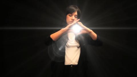
Watching Cécile B. Evans’s video “Straight Up,” which first inspired the title for this exhibition, it gradually transpires that something is wonderfully off. For most, the first and most obvious disjunction will be the fact that we may not be sure what the artist is “signing” with her gestures, standing before the camera in front of a pure black backdrop. But slowly, subtly, things seem to blur: Evans’s gestures become less precise and almost sluggish; and then animated light bursts, flashes, sparkles and illuminated vapour trails begin to emanate from the artist’s gestures, animating the black space with an almost Pokémon jouissance.
We may need to read the artist’s statement to discover that progressively throughout the performance, though we cannot decipher how, she is becoming more and more inebriated. She is found to be drunk-in-charge-of-a-deaf-signing-karaoke-performance. Her irresponsibly funny body refuses to keep time with the tempo of the song; and her facial expression and hand gestures casually contradict the longing and urgency of Paula Abdul’s lyrics:
I've been a fool before
Wouldn't like to get my love
Caught in the slammin' door
Are you more than hot for me
Or am I a page in your history book?
I don't mean to make demands
But the word and the deed
Go hand in hand
How about some information, please?
How is it possible to reflect on sentimentalised experiences at the same time as being “in” them? Cécile B. Evans manages to straddle both camps. For those who might feel they are living through a moment that is aptly captured by Paula Abdul’s lyrics, the fact that Evans seems increasingly “under the influence” may be an apt metaphor for the experience of being a prisoner to love.
O
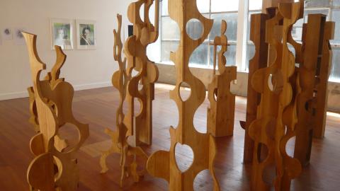
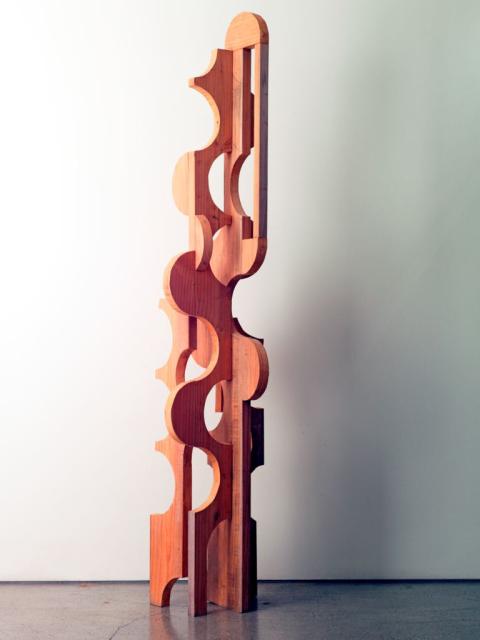
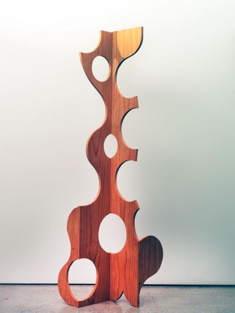
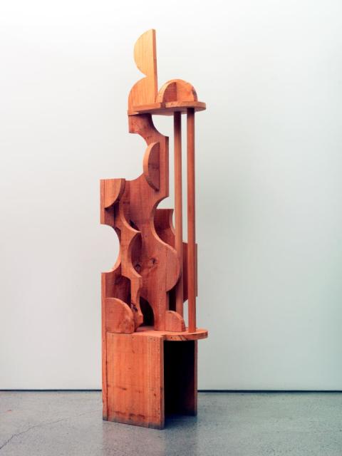
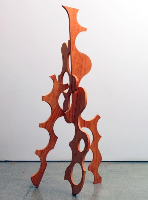
I was introduced to Grant Gallagher a few years ago and learned of the treasure trove of sculptures that he had been quietly making and accumulating at his home and workshop in Auckland over the course of three decades. It is therefore very exciting to be able to present a complete series of his works. The twelve sculptures in Gallagher’s series “You’re only as pretty as you feel” (1999-2002) are presented in a tight cluster, forming an enchanted forest reminiscent of Max Ernst’s surrealist paintings of enchanted forests, such as “Forest and Dove” (1927) and “The Forest” (1927-28), and his automatist wood-grain drawings of the same period, with their densely textured grattage and frottage surfaces. But Gallagher’s works, originating in the South, differ markedly in their tone from Ernst’s conception of the forests of Oceania as “savage and impenetrable, black and russet, extravagant, secular, swarming, diametrical, negligent, ferocious, fervent, and likeable, without yesterday or tomorrow.” Gallagher’s forest, while made of rough boxing and fencing timbers, possesses lightness.
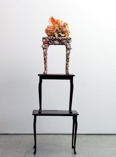
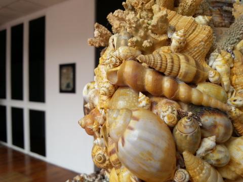
Though the link to Ernst is curatorial licence; but the artist’s deliberate re-working of another modern European aesthetic is more studied. Taking a cue from the numerous and ornate illustrations of the 19th century German biologist, naturalist, philosopher and artist Ernst Haeckel (1834-1919), Gallagher creates his own shell and coral curiosity in “The Birth of Aphrodite” (2012). In Gallagher’s hands the over-embellishment eschews the scientist’s regularity, serried rows, symmetries and classifications by type; instead the Auckland artist embraces the decorative chaos of grotto aesthetics.
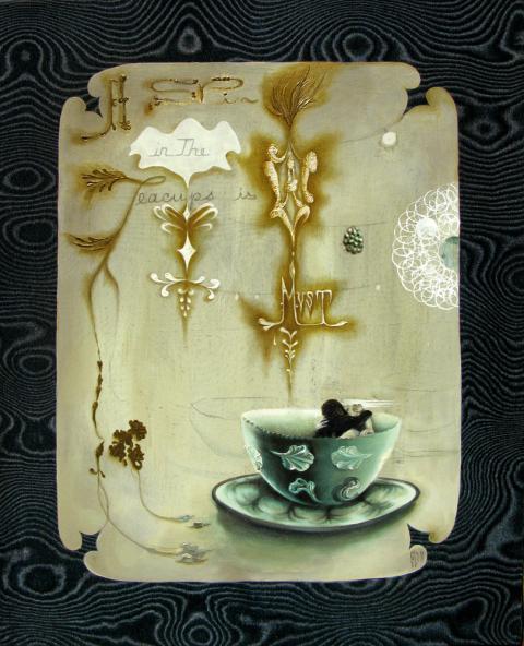
Georganne Deen’s intimate painting “A Spin in the Teacups (Is a Must)” (2011) is a companion piece to the ornament of Gallagher’s shell-encrusted piece and to the inebriated sensuality of Cecile B. Evans’s “Straight Up.” Like the former, Deen presents seductively embellished surfaces which the eye can wander across almost aimlessly: curious without necessary intent; and like the hooded eyelids and hands that mess with, and massage, Abdul’s lyrics in the performance by Evans, a feral sexuality is at play within the details of Deen’s work. Most notably between the two embracing figures in the teacup. Are these Ann Darrow and a diminutive Kong; a booth-sized Ape? Whether they are or not, the Blonde Beauty and Hirsute Beast are beautifully figured in their fun fair ride which swirls an unanswered fortune teller’s question.
A different kind of mystery infuses the way both Emma Garrett and Anastasia Klose create a bridge between something quite private, intimate, even awkward whose vernacular is inward-looking, and the public realm of presentation and extrovert expression. These works are of interest because they have the power to conjure the thought “why am I being shown this?”
In Emma Garrett’s gentle and loving treatment of gumboot dancing, we sense the artist is enthralled with the dancer’s folky obsession; and admiring of what seems like joy-without-irony. The figure-ground relationship suggests the almost trance-like aura-body relation of the dancer’s experience of being lost in, subsumed by, his own movements and energy. Garrett suggests a moment where the dancer is consumed by the dance and thus moves regardless of whatever might be happening around him. The gestures and interiorised moment are those of a child lost in play, or of an adult day-dreaming. Is it naïve, childlike, fanatical or backward? Do we smile, join, gape or turn away?
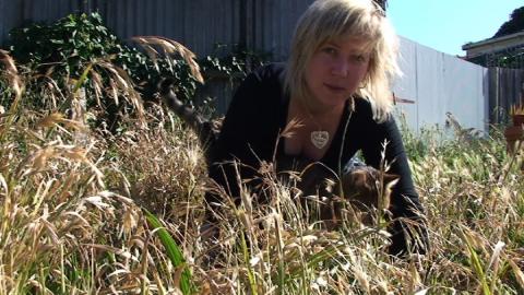
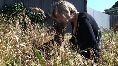
“True Love” is a big feeling. Suddenly, Anastasia Klose brings the giant balloon of this thought down to earth by cuddling her cat in her sunny backyard. Klose has this ability to put something huge and full of baggage out there, and then to handle it in such a way, not that it becomes tame, but so that it becomes homely. Without her cat figuring as it does it feels impossible to ask about loving “truly, madly, deeply.” Ordinarily if I love like this and say so, I may be taken as a fool; as naïve; and ignorant of simply re-using romance novelist Barbara Cartland’s famous phrase. Or worse, I may be taken as miserly, as knowingly shipping my feelings in used crates. If I say I love you truly, madly, deeply, I must whisper these words with such tenderness; with such unselfconscious spontaneity that their pre-worn attributes don’t clang around the room and drown me out. Refreshingly, Klose and her cat show us how.
S
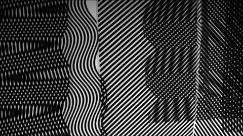
Nathan Gray’s graceful and seemingly effortless video appears at the start as if it may be a seamless computer-generated riff on animated moiré patterning. But cracks soon emerge that reveal the work’s more humble, almost kitchen table origins. Gray’s moiré patterns are generated by layered sheets of acetate printed with stripe patterns, that he slides across each other at different angles and at times rotates as if we are watching a slow-moving mobile. They suggest a doodling playfulness on the part of the artist.
Moiré patterns are a delight for the very reason that they are not straightforward; they are never just what they seem at first glance. Three more of the artists showing here are drawn to the moiré pattern’s complicating nature: Deen, with her choice of rayon moiré fabric as the surface of her painting; the hide-and-seek play of Virginie Mossé’s paper cuts; and André Sampson’s layers of painterly dots and stripes.
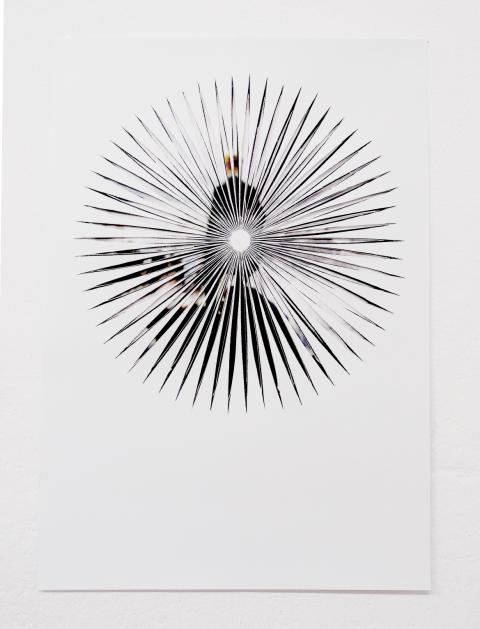
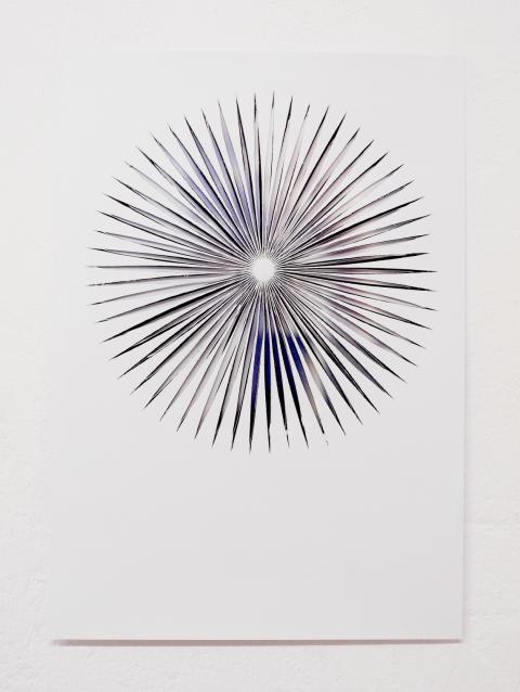
In Virginie Mossé’s series “Wie Du Dir so Ich Mir” (Tit for Tat) from 2009, pop, advertisement and propaganda imagery, which is routinely presented as easy to read, is obfuscated by the artist’s overlaid cut-outs. Her paper cuts run interpretive interference across our gaze. We may feel some of the images are easy to work out through the slits, while others may remain quite opaque. But we should not take the former as success and the latter as failure. Mossé would have us consider the impossibility of full and final comprehension.
On the one hand the works can be seen as a demonstration that what we see in the media is so mediated that we need to look beneath the surface to find the other side to the story, discover what has been omitted, or understand alternative points of view or significance. Nothing is as it seems; and the more something seems to be self-evident, the less it is likely to be so. Mossé believes we need to repeatedly wake ourselves up to this perspective; that we can too easily fall asleep, or be induced to drowsiness by the incessant bombardment of image and slogan. Her insistence on the need for vigilance is a call for us to be always uncertain.
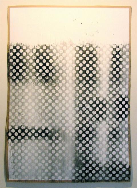
André Sampson’s “xxiii” (2012) is deceptively simple; elegant too. As I read it, Sampson’s watercolour runs a kind of art historical interference across two generations of New Zealand artists, specifically Colin McCahon and the contemporary duo of Michael Parekowhai and Peter Robinson, both of whom teach at the University where Sampson is completing her postgraduate degree. The dark shadowy forms appearing in the spaces between the white dots that cover three quarters of the painting look like fragments of letters spelling out an abridged form of “I AM / AM I / HE / EH.” On the left there is an “I” and an “A” overlapping each other; and on the right an “H” and an “E” sandwiched together. The “M” is not inscribed; though neither is it absent; nor the “S” with which Sampson could have interposed herself (but that would have played by the same rules rather than shifting them). It doesn’t seem a stretch to read in these forms Sampson’s allusion to the ghost of the father of New Zealand’s late-arriving Modernism and the shadows cast by his sons. Namely, her partially erased texts abridge a lineage of well-known inscriptions and titles: McCahon’s ‘I AM’ inscribed in his monumental “Victory over Death 2” (1970); and his ‘AM I Scared Boy (EH)’ in “Am I scared” (1976); Parekowhai’s sculptural spelling of ‘I AM HE’ in “The Indefinite Article” (1990); and Robinson’s ‘BOY, AM I SCARED EH!’ in “Boy Am I Scared Eh!” (1997).
Eschewing slogans, and located outside of the sorts of national and ethnic identity debates that contextualised the works of the New Zealand father and sons, Sampson’s intentions with these references remain ambiguous. She writes no slogans; her title a simple Roman numeric thirteen. (Who was the thirteenth: Christ or Judas?) She nods in the direction of legacy and keeps moving.
T
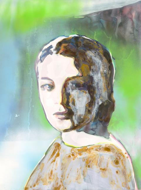
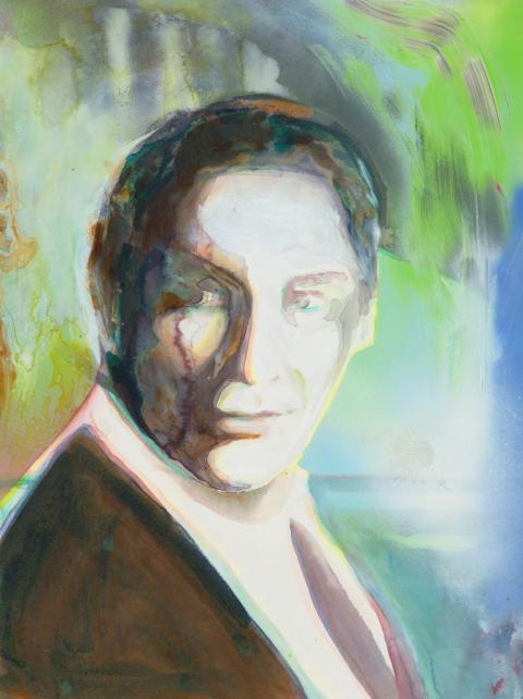
Visiting Katrin Kampmann’s Berlin studio in April 2012 I was immediately taken with the luminosity and mystery of “Solaris” which was pinned to the sunlit wall in amongst other portraits and nestled up to Kampmann’s huge landscape paintings. Having long been a fan of Andrei Tarkovsky’s films, the phantasmagorical associations of Kampmann’s title, harking back to the 1972 Russian film of the same name and to Stanisław Lem’s 1961 novel from which it was drawn, added to the work’s magnetism. The haunting visual power of Kampmann’s “Solaris” along with its literary and filmic baggage made it one of the early keystones for “Lost in a dream” as the exhibition was taking shape.
Kampmann’s painting portrays Rheya, Tarkovsky’s lead female character, who is a transient simulacra of the former wife of the protagonist Dr Kris Kelvin. On earth she had committed suicide when Kelvin abandoned their marriage, but later appears as a chimera at his side in the space craft that hovers above the planet Solaris. Kelvin is plagued by longing and guilt in regards Rheya, but also in regards to his elderly and dying father who he has abandoned in order to undertake the scientific space mission. As the film unfolds, the narrative arc appears to commence with Kelvin’s last days on earth reflecting on his life while wandering near a lake near his childhood home where his elderly father still live; moving then to the Solaris space station; and finally returning to the lake and his childhood home again. But what Kelvin experiences as a return home, transpires to be another hallucination induced by the sentient planet. Thus we begin to question whether the whole narrative might in some way be a hallucinogenic Mobius loop in which the pairings of earth and planet, past and present, external forms and internal feelings, are unstable and uncertain.
As Kampmann and I talked about the “Solaris” piece and its place in the exhibition she was drawn to Paula Abdul’s lyrics and offered to make two additional portraits. “Do, do you love me?” and “You are so hard to read” are the result. The two newest works are inspired by, and titled after, lines from Abdul’s song; and both also tie themselves to a film narrative involving the uncertainty of longing, guilt and the unexplained within a complex and ultimately doomed romantic relationship.
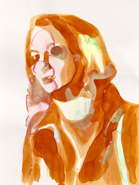
“Do, do you love me?” and “You are so hard to read” show two of three leading characters from Claude Sautet’s 1970 film “Les choses de la vie.” The woman is Hélène played by 1960s and 70s screen idol and Sautet’s muse Romy Schneider; and the man is Pierre, a successful highway engineer, played by Michel Piccoli. Hélène is Pierre’s adoring and free-spirited mistress and romantic foil to the third, and here absent, leading character, his long-suffering wife.
Just as in “Solaris” Kampmann is drawn to a narrative that folds together past and present, regret and hope, reality and hallucination, in charting the complexities of love and longing. In “Les choses de la vie” Pierre’s desire and regret is narrated in a series of flashbacks as he lies semi-conscious and fatally injured in the wreckage of his own car crash on a rural motorway. Based on a novel by Paul Guimard, the story is a patchwork of memories of his entanglement with the two strikingly different women in his life, woven together with dream-like slow motion sequences of the car accident itself.
Kampmann’s interest in Romy Schneider folds additional layers of sad longing into the fictional and filmic narratives that underpin the work. In Germany, there is an enduring idolisation of Romy Schneider which draws breath from a complex mixture of her magnetic screen presence, the annual Christmas-time re-runs of the “Sissi” trilogy and the role that launched her career, and her poignant personal life and tragic end.
While art and life merge with compelling emotive and psychological energy here in the beautiful figure of the Austrian actress, it is a resonance which the artist knows may not resonate so directly outside of Germany, Austria and France. Therefore in creating the painting initially for an Auckland audience, the artist knowingly entertains the possibility that the luminosity of the star’s aura may be dulled in translation: foggy instead of bright; and in this it echoes the highway engineer’s fading consciousness and fragmentary but haunting recollections. Kampmann’s portrait circles around the uncertain relationships between longing and memory, love and abandonment, death and hope, distance and proximity.
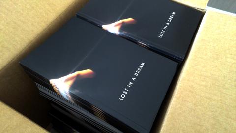
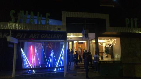
This essay was originally published in Rob Garrett (ed./publ.), Lost in a dream (ISBN 978-0-473-22063-1) which accompanied the exhibition “Lost in a dream” at Snake Pit, 33 High Street, Auckland, New Zealand (19 October – 10 November 2012).
Images are courtesy of the artists and Rob Garrett.